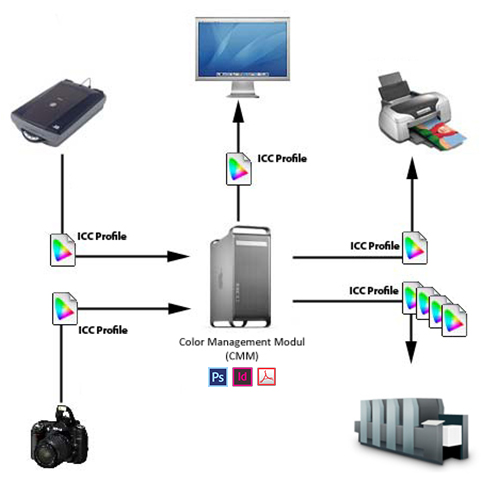
The accelerated pace of our world and the drive to comply with the requirements for increased accuracy in the reproduction of colors makes it absolutely necessary to use a properly adjusted and calibrated color management workflow between the customer and the printing house. The ICC color profile based technology provides interoperability between different software systems and devices working on various principles.
Use of ICC color profiles
Technically, color profiles describe the color attributes of various devices (cameras, monitors, printers, printing presses) used in the reproduction of colors. They are also used to convert a specific color captured by an input device (camera) so it can be reproduced with a device (printing press) working on a different principle without any change in its hue, tint or shade.
In simple words, this means that for each software applications involved in the processing and communication of colors (Photoshop, InDesign, Acrobat) you need to configure a suitable color profile.
Selecting the correct output ICC color profile
For typographical reproduction it is always important to set an ICC color profile in your programs that is suitable for the given printing technology and the substrate (paper). Since parameters for offset printing are set in accordance with the ISO 12642-2 standard, you will need to use the related standard color profiles.
| ICC Profile name | Paper Class | Paper Class Code |
|---|---|---|
| PSO Coated v3 (FOGRA51) | For glossy and matte coated papers | PS 1 |
| PSO Uncoated v3 (FOGRA52) | For uncoated papers | PS 5 |
| PSO LWC Improved (ECI) | For Light Weight Coated papers | PS 2 |
Color management settings
In every professional software applications that are suitable for producing print-ready materials, you can access color management settings handled by the operating system. In addition to selecting ICC color profiles, you can use these settings to adjust other options that can have a significant impact on the color separation of your files, and the coloration of the images displayed on your monitor. Obviously, if you want the display settings to have a noticeable effect on your monitor, you will need to have your monitor calibrated with a measuring instrument (spectrophotometer).
In Adobe applications (Photoshop, InDesign, Illustrator), you will access the central color management settings through the Edit > Color Settings… menu item.

![]() Working space RGB
Working space RGB
Color profile of the working space if you work in RGB color mode. Usually it is set to Adobe RGB or sRGB.
![]() Working space CMYK
Working space CMYK
Color profile of the working space if you work in CMYK color mode. You will need to set here an ICC color profile that is suitable for your output (printing technology). Important! There is no one-size-fits-all setting: you will always need to use a color profile that is suitable for the production technology and the given substrate (paper).
![]() Color Management Policies CMYK
Color Management Policies CMYK
If you use the ‘Convert to Working Space’ option, the elements that use the CMYK color space will be converted to the color profile set for the working space.
![]() Color Management Policies
Color Management Policies
We recommend ticking all of the three checkboxes, because then the program will warn you when you open or insert images with a color space that differs from the color space of your working space. They might have a color profile missing, which would prevent you from finding out if a color conversion is performed, possible against your wishes.

We recommend ticking all of the three checkboxes, because then the program will warn you when you open or insert images with a color space that differs from the color space of your working space. They might have a color profile missing, which would prevent you from finding out if a color conversion is performed, possible against your wishes.
Color management when creating a PDF file
It is important to ensure that your color related settings are correctly applied, not only while you are editing your file, but also when you generate the PDF output. When you save a PDF file, there may be special settings that override the results of your color management choices, and for this reason it is very important to configure every option correctly in this step.
In Adobe applications (InDesign, Photoshop, Illustrator), you can find these settings in the Output section of the dialogue box that opens when you want to save a file in PDF format.

![]() Color Converison
Color Converison
If you select the ‘Convert to Destination’ option here, then the color separation of every element on the page will be performed according to the output color profile (Destination) when you save your work in PDF format, even if it was not performed while you were editing the file.
![]() Destination
Destination
The output color profile. You will need to set here an ICC color profile that is suitable for the given output (printing technology). Important! There is no one-size-fits-all setting: you will always need to use a color profile that is suitable for the production technology and the given substrate (paper).
![]() Profile Inclusion Policy
Profile Inclusion Policy
You can chose if you want to embed the color profile into the file. (When the file is saved in certain standard PDF/X formats, the color profile will always be embedded.) Basically, while embedding the color profile is not an absolute requirement in terms of the technology used (if the employed color profile was otherwise suitable), however, without such an embedded profile, the recipient of the file cannot verify that the correct color profile was used. It is the transparency of the color communication process that warrants the embedding of the color profile so that the recipient can check it and use it to convert the colors if there are inconsistencies in the file.
Color matching while editing
Naturally, you can make the most of the possibilities stemming from the production parameters (mostly, the paper) of your publication in terms of colorization if you can see and carefully monitor the effects of the edits on the printed product while you are still editing the file. This means that if you use a Photoshop program that has been correctly configured in terms of color management, you can find the ideal color settings for a given image which will produce the best results when the image is printed on the given paper. Thus it is important to ensure that not only your color separation settings are correct, but also the display settings of your programs, which can be found in the View menu in Adobe products (Photoshop, InDesign, Illustrator).
![]() Proof Colors
Proof Colors
You should always tick this option! When it is active, the program will not only perform the separation/encoding of the colors according to the configured ICC profile, but they will also be displayed on the monitor according to the same color profile. (If the monitor is calibrated correctly.)
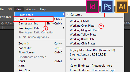
![]() Proof Setup > Custom
Proof Setup > Custom
You can customize the color matching output in this menu item. See the following figure.

![]() Device to Simulate
Device to Simulate
Here you will need to configure an ICC color profile that describes the color reproduction attributes of the output device you wish to simulate. This means the color profile that is suitable for the paper on which the given product will be printed!
![]() Display Options – Simulate Paper Color
Display Options – Simulate Paper Color
This option should always be enabled, because otherwise the whitest point of the product will not match the white color of the printing paper, but the whitest color of the monitor. This may profoundly affect your color vision.
Color matching display of the finished PDF file
Before submitting the finished PDF files to the printing house, double checking them in terms of their content, the technology, and obviously the correct colors is always recommended and useful. In Adobe Acrobat Professional you can also customize your color matching display settings by using a color profile suitable for the printing paper of the given product (View > Tools > Print Production > Output Preview).

![]() Simulation Profile
Simulation Profile
Here you can set the ICC color profile used for color matching display. Important! There is no one-size-fits-all setting: you will always need to use a color profile that is suitable for the production technology and the given substrate (paper).
![]() Simulate Overprinting
Simulate Overprinting
It should be ticked, because if it is enabled, the program will take into account the overprint properties that you set for the individual objects when you edited the file. You can use this option to check if the final product would show undesirable visual effects due to objects getting overprinted/knocked out.
![]() Simulate Paper Color
Simulate Paper Color
This option should always be enabled, because otherwise the whitest point of the product will not match the white color of the printing paper, but the whitest color of the monitor. This may profoundly affect your color vision.